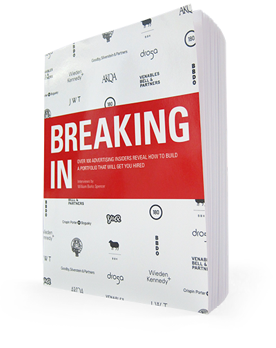
Breaking In

Over 100 Advertising Insiders Reveal How to Build a Portfolio that Will Get You Hired

Interviews by William Burks Spencer

Get new posts via Twitter, Facebook, RSS, or Email

Breaking In's front cover

The interviewer is interviewed

Breaking In author William Spencer was recently interviewed by Christopher Cryer of Shellsuit Zombie, a UK-based organization that is all about helping young creatives. That’s what we’re all about too!

Here is the full text of the interview:

Breaking into the ad industry? This’ll be handy.

A bead of sweat runs down your hand and drips onto the front page of your portfolio (book), distorting the inked title, as your parched lips sip a post-crit beer.

It’s a hot, muggy, competitive placement season. So if it’s all getting a bit much for you, read this refreshing advice from William Burks Spencer. He’s interviewed over 100 of the world’s top Creative Directors & Creatives – specifically on what they want to see in your book. And now, I’ve interviewed him.

zombie

Continue reading

Read the full interview in BREAKING IN: Learn more about the book or Buy it on Amazon

Interview Excerpt: Mark Fitzloff, Executive Creative Director, Wieden+Kennedy, Portland

Check out some great work from Mark Fitzloff.

WS: What do you look for in a student book? And what impresses you?

MF: I look for intelligence, I think. It’s not so much the packaging, or the choice of media, or necessarily how finished something is, but I look for something that makes me think, “I bet that the person who made that is a smart guy or a smart girl and I just want to learn more about that person.” And I know that’s a bit vague, but I think you have to look at something and go, “Did it take a little bit of wit, or insight, or knowledge of some sort to come up with that solution?” And then I think it’s good. That gets me interested in seeing more.

WS: You said you’re not that concerned about the finish necessarily; do you think sketches can be enough these days, or not?

MF: It’s kind of a sliding scale. I think that I’d be lying if I said that I would prefer something that was unfinished. I think that we all pride ourselves on saying we’re looking for something smart and it doesn’t matter what form it takes. That said, polish can’t hurt. It’s just the old “polishing a turd” cliché that I think is absolutely true—it’s not going to help if the idea’s not there.

But what I wouldn’t suggest is poking at something. I think we do this, whether it’s a student book or an actual commercial you’re working on. It’s like poking at a dead thing on the road: the more you poke at the dead frog, it’s going to start to fall apart. You’ve got that stick and you’re just trying to tweak this, and push that. At best, no one’s going to notice and it won’t really matter. You’re just wasting your time. At worst, you’re actually going to make it worse and it’s going to start to fall apart. So I think that you have to use trusted opinions around you because sometimes you get so close to something that you’re not sure when to say, “Okay, pencils down. This is good enough to communicate the idea–that’s all I need to do.”

Now, there’s lots of different jobs out there. If you’re more design heavy or if you’re hoping to get a studio job [it’s different]. Certainly a lot of art directors would probably have a different answer. They are going to be looking for execution. But as far as I’m concerned, if a sketch can deliver that little flash of genius, or intelligence, then you’re done—time to move to the next thing.

[ … ]

Continue reading

Read the full interview in BREAKING IN: Learn more about the book or Buy it on Amazon
Next Up: Mark Fitzloff

Mark Fitzloff is Executive Creative Director at Wieden+Kennedy, Portland.

Chrysler – “Born of Fire”

Old Spice – “Painted Experience”

Continue reading

Read the full interview in BREAKING IN: Learn more about the book or Buy it on Amazon

Interview Excerpt: Ty Montague, Founder & Partner, Co:, New York

Check out some great work from Ty Montague.

WS: What do you look for in a student book? And what impresses you?

TM: I always look for two things: Work that makes me uncomfortable and work that falls outside the bounds of what most folks would consider to be advertising. What I tell juniors is that, for the rest of their career, they will have someone telling them why a certain idea is too weird or crazy to show to a client. This is their time to show what they really believe is great. I hired a guy once because he had invented a line of products that were designed to raise money for the democratic party…peanut butter, jelly, stuff like that. I thought it was a genius way to raise money and, at the same time, raise awareness for the cause while people are walking down the aisle at Walmart or Piggly Wiggly. It’s not a crazy or extreme idea, just a really smart way for the party to communicate in a new way with people, and to raise money.

I also consciously look for people who have creative passions outside of advertising: photography or painting or poetry or music or whatever. I think that the more advertising draws from and stays close to the fine arts the better off we will be as an industry.

The third thing I look for these days is an appreciation for the possibilities of technology. I just read that the History Channel is using Foursquare to promote a show about the history of America by enabling little pop-ups that tell you about the history of the location where you are checking in. Genius. Very much advertising, but advertising that is completely contextual and hyper-local. A book with ideas like that in it goes a long way with me.

Continue reading

Read the full interview in BREAKING IN: Learn more about the book or Buy it on Amazon

Next Up: Ty Montague

Ty Montague is Co-Founder and Co-CEO of Co: in New York.

Bing – “Fast Forward”

Smirnoff – “Green Tea Party”

Continue reading

Read the full interview in BREAKING IN: Learn more about the book or Buy it on Amazon

Interview Excerpt: Gerry Graf, Founder, Barton F. Graf 9000, New York

Check out some great work from Gerry Graf.

WS: What do you look for in a student book? And what impresses you?

GG: The first thing I look for is campaign ideas. It’s like the first filter. Not just a lot of one-shot-y things, or guerrilla tactics, or this and that. Just a bigger idea. And then I look for people who don’t think the way I think. I like to look at an ad and not really be able to figure out how the person came up with it. I mean, a lot of times, you still see the same crap…like you see a lot of toothpaste ads with a lot of white people because it makes things really white. I love seeing ads that I like but not understanding what wavelength that person is on. So, odd thinking, 
I guess.

WS: How did you get into the industry initially?

GG: I was a stock broker when I graduated from college. I wrote for a comedy review at Notre Dame. I went to the University of Notre Dame and I loved doing that. So I kind of had a sit-down with myself and I wanted to wake up each morning and want to do what my job was. And I thought back to what my favorite thing to do was and it was writing for that review. So I screwed around with pilots and all that kind of stuff, and it didn’t go anywhere and somebody said, “You should try advertising.”

Continue reading

Read the full interview in BREAKING IN: Learn more about the book or Buy it on Amazon

Next Up: Gerry Graf

Kayak – “Brain Surgeon”

Nextel – “Dance Party”

Continue reading

Read the full interview in BREAKING IN: Learn more about the book or Buy it on Amazon

Interview Excerpt: Kash Sree, Executive Creative Director, SR33, New York

Check out some great work from Kash Sree.

WS: What do you look for in a student book? And what impresses you?

KS: What impresses me? Clarity of thought. Freshness of thinking, too. And sometimes those two can fight each other. Just getting it. Stopping power. What’s happening now is there’s a lot of the “Crispin-ization” [Crispin Porter + Bogusky] of books as everyone goes 360, forgetting that what you need is an idea first of all that then spreads out. Not, “I’ve got all these bases covered.” So I personally like to see a strong idea that’s got some sort of legs, or can resonate. This is something that Crispin actually does, but students misinterpret and just scattergun weak ideas across different media.

I’ve got three rules that I like to apply when I’m looking at print ads, or any ads. And that’s, one, does it stop me? Two, is it original? Because you don’t want to be advertising someone else’s product. And three, does it make me buy into the product? Now by that, I don’t mean, you’re not going to rush out and go and grab it off the shelves, like they did in the sixties. We were still getting out of the war and were just not used to having stuff. But you’re creating this relationship with the products. So if your ad makes people reconsider–it’s like, “I wouldn’t mind hanging out with that product.” And when you need a product of that type, that one will be on your list. That’s enough. That’s what I want them to do. So that’s my three rules.

Continue reading

Read the full interview in BREAKING IN: Learn more about the book or Buy it on Amazon

Next Up: Kash Sree

Kash Sree is Executive Creative Director of SR33 in New York.

Nike – “Move”

Nike – “Tag”

Continue reading

Read the full interview in BREAKING IN: Learn more about the book or Buy it on Amazon

Interview Excerpt: Jason Bagley, Creative Director, Wieden+Kennedy, Portland

Check out Jason Bagley’s work in Part 1, Part 2, and Part 3.

JB: I would say I want to be surprised and delighted. I don’t know if I should use the word “delighted.” Maybe just surprised. It’s a surprisingly rare quality in a portfolio.

WS: Surprise is surprisingly rare.

JB: Yes, surprise is surprisingly rare.

WS: Is it just breaking out of formulas?

JB: I think it takes a while to break out of formulas, and I understand…when I was first starting out in advertising, I was guilty of the same thing. But what I don’t want to see is a bunch of clever or effective solutions—communication solutions to a client’s problems.

WS: You don’t want to see that?

JB: I don’t want to see just that. And that’s what you see a lot of. It’s like, “Yeah that’s a good concept and they effectively communicated the point of what the client would have wanted.” But it’s cold and sterile and boring and unsurprising. And I think you’ve got to…for me, I want to see something where there’s personality and more of a human voice coming through so it doesn’t just feel like a corporation is communicating with me. It feels more like an actual personality is coming through. I also try to ask myself, “Is something good for an ad? Or it is just good?” Like, “Is it just great regardless of what it is? Is it just great entertainment and something that gets you excited or surprises you or just blows your mind?”

A brief is like a math problem, and the challenge is that when we come up with a solution, there’s an excitement because we have technically “solved” it. But that excitement can cloud our objectivity. Simply coming up with an answer isn’t enough—we have to come up with a beautiful, or inspiring, or funny solution that gets people to look at the problem in a new way.

Continue reading

Read the full interview in BREAKING IN: Learn more about the book or Buy it on Amazon