Dave Bell is Partner & Creative Director at KesselsKramer, Amsterdam and KK Outlet, London. The explanations below are in his own words.
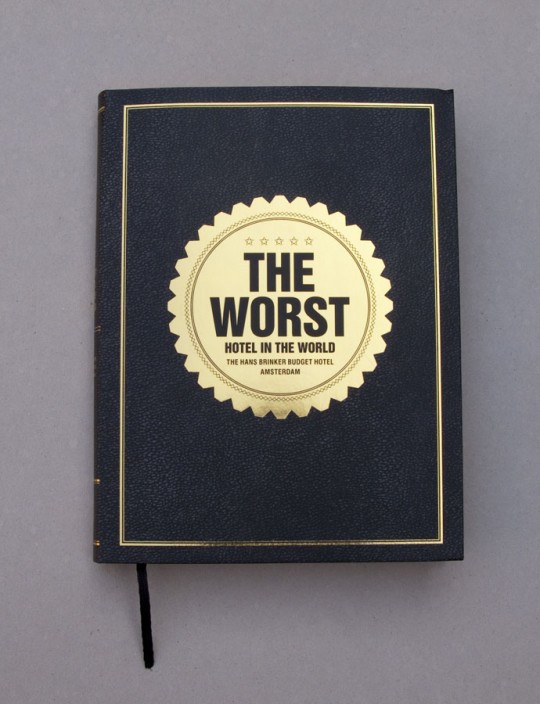
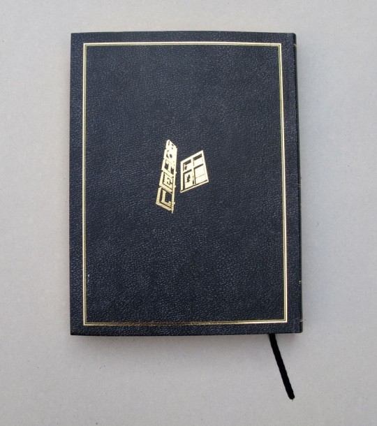
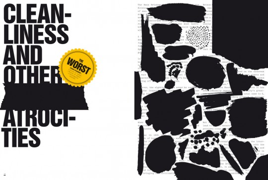
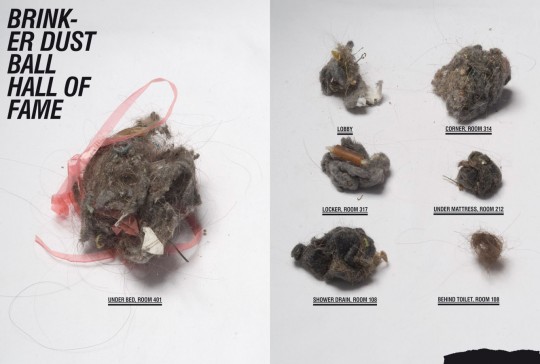
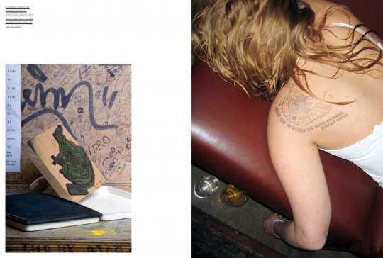
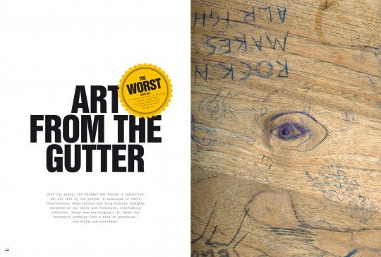
“The Worst Hotel in the World” – Book for Hans Brinker Budget Hotel
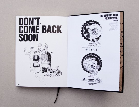
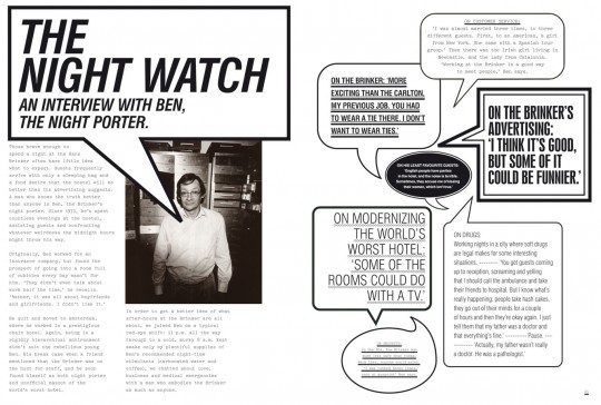
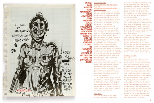
We set up our own publishing company some years ago, because we like books and we like making books. We’ve had them published by others, and through that learned the ropes and started our own publishing company which became a business in its own right. Eventually all this knowledge – which might equally have its roots in documentary-making or product design – can filter through to the work we do with clients. So, with the Brinker – after 15 years of work – we were approached to make a book about it. We saw this as the next ad campaign, just in a different form than before. We called it “The Worst Hotel in the World.” So now it sits alongside other hotel books in stores, propped up against “The world’s luxury hotels”-type books. It’s also at online booksellers like Amazon and guests can pick it up in the hotel lobby as a reminder of the stay they’ll have forgotten about because of the 1,700 heinekens they drank at the bar. The book contains stories from the night porter, a diary of a writer who spent 4 nightmarish weeks in a dorm; the economic case study of the Brinker’s success. And the ad campaigns.
Movie Stamp – NL Post
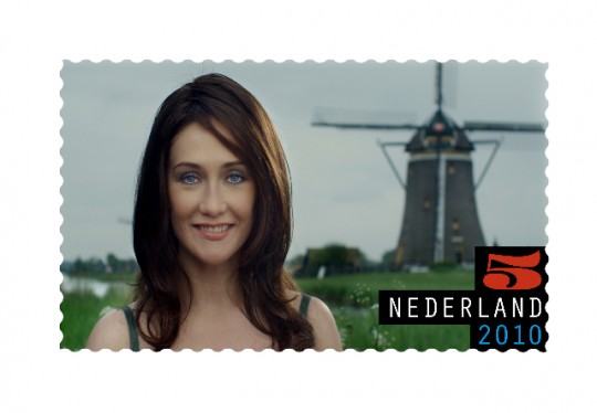
We were asked to design a stamp for the Dutch Postal Service (for the 3rd time.) It is like being asked to redesign the dollar bill. Quite an honour. The idea here was to make the smallest and shortest film festival in the world. In the end we only made one, so it became the smallest and shortest film in the world. However the print run of the stamp was 350,000.
We recruited Anton Corbijn (The American, Control) to film it, and it starred Carice Van Houten (Black Book, Valkyrie). It is only 30 frames long and is an updated version of a classic Dutch stamp. I won’t spoil it by telling you the ending of the film. The best thing about it was that a massive premiere was organised with red carpet, paparazzi, a screening – the whole works. The actress and director turned up; and then after twenty seconds – the length of the film with some introductory titles – every one was asked to leave again.
CitizenM Hotels
We have moved quite a bit into brand development in recent years which has a lot of the ingredients we strive for. We get to be at the start of the process. We can influence or create the brand, name, and personality, making it ultimately much easier to create an effective (we hope) and holistic communication campaign off the back of it.
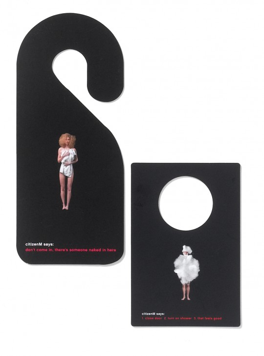
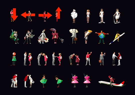
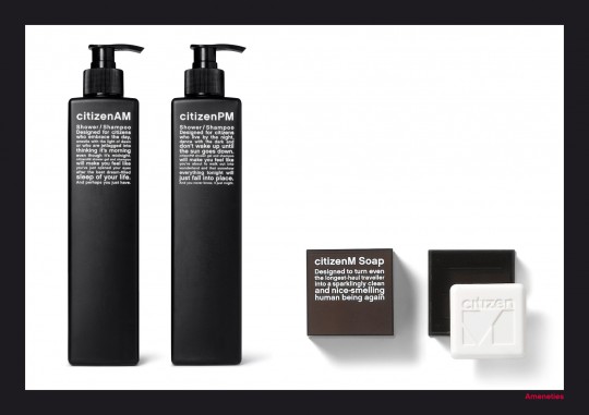
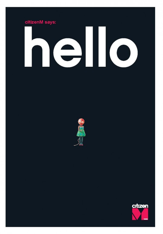
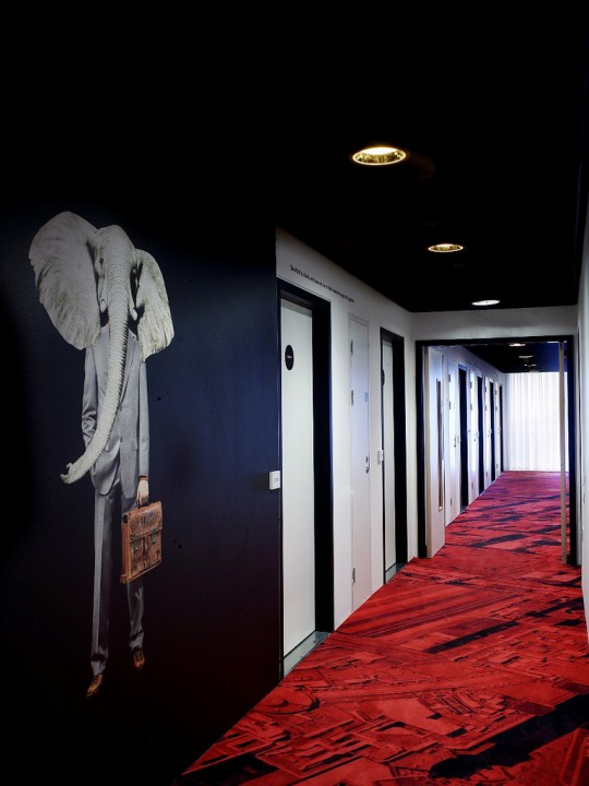
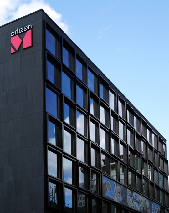
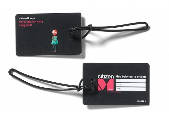
We got asked to help come up with a new name and logo for a hotel, but not just that. To think about the brand personality, how the hotel speaks with guests, how it inducts new staff, the housestyle elements, the toilet signs, amenities, booking site, and most of all, what it stands for. There was no advertising budget or media spend. We realised most hotels are all about themselves, and this was a hotel that thought about what a guest needed (up to date technology, good price, great lobby, 24 hr bar, nice design) and what he or she didn’t (a trouser press, massive room you don’t use, pointless additions like a ‘turnover service’). So we coined a phrase for this new kind of traveller – the mobile citizen – and named the hotel after them. Making CitizenM. With that came the tone (worldly wise but with light humour) the housestyle, and interior singage (a mass of tiny citizens who guide you around the hotel), a man with a giant elephant’s head (no real reason) and things to make the jetlagged traveller smile (or grimace depending on his/her tolerance level). We saw everything as communication – from the stealable ‘do not disturb’ signs to the soaps and the booking site. It seems to work – the notoriously tough TripAdvisor audience has given it awards two years running and new hotels are opening in NYC (Bowery, Times Square) and London.
The Lost Collection – Transport for London
We travel by tube every day, as do most Londoners. But there is a – sometimes unwarranted – hatred for the engineering marvel that is the London Underground. We’d heard about this mythical cavern beneath Baker Street which looked like the end scene of Raiders of the Lost Ark and contained over a hundred years of marvels and relics that acted like the best document of London that the city never knew it had. That place was called the Transport for London Lost Property Office.
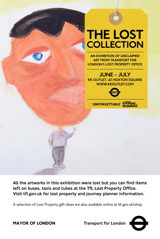
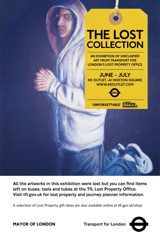
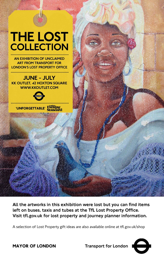
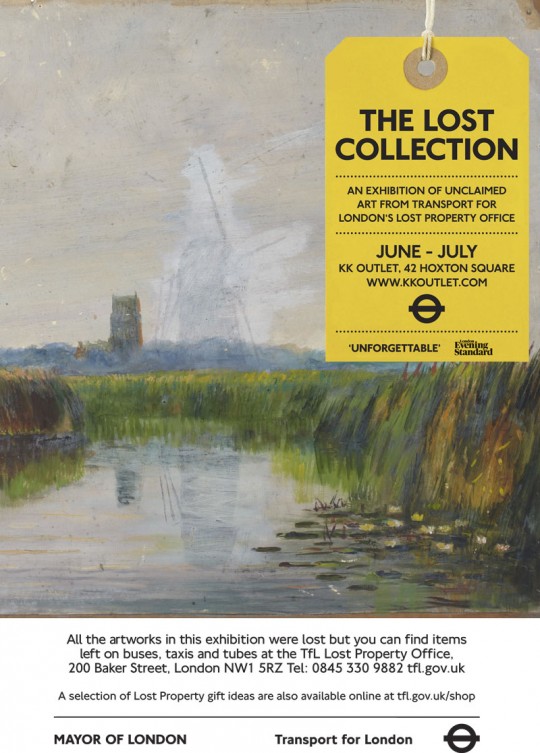
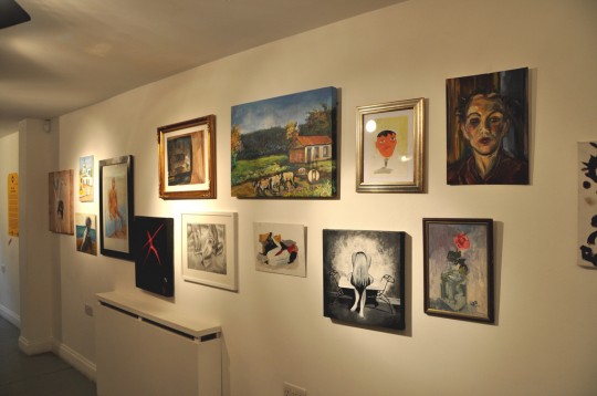
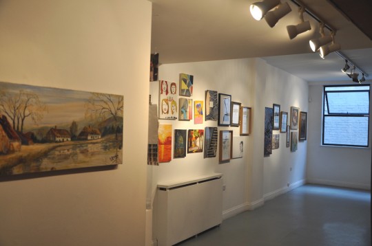
In our London office, we have a gallery, one that runs as its own business and where we do a different show every month. It’s created quite a following and we wanted to branch out a bit with different kinds of shows. We first wanted to do an exhibition showing all the historical items left on the transport system – from WW2 gasmasks to 80s mobile phones the size of breezeblocks. However when we visited the Lost Property, asides from the peculiar items left behind (a coffin, a blow up sex doll), we noticed a lot of art portfolios, oil paintings and other personal art by forgetful hobbyists. We found out that after 3 months the office were obliged to remove all unclaimed items meaning – sell them, if they were worth something or incinerate them if not. The artworks would be burned. So over the course of a year we set about collecting, then curating, all the artworks lost on the buses, taxis and tube. We then did a gallery showing of the artworks with an aim to reunite artists with their works. It also acted as a goodwill ad campaign for the much maligned transport system, as well as communication (we had a run of posters on the underground stations) for the lost property office itself. It was deemed such a success, the NY transit system, Paris and Tokyo will take the idea on culminating in a mass show in London in 2015. And, some artists got their lost artworks back, which was the best bit about it.
Alternative Royal Souvenirs – KK Outlet
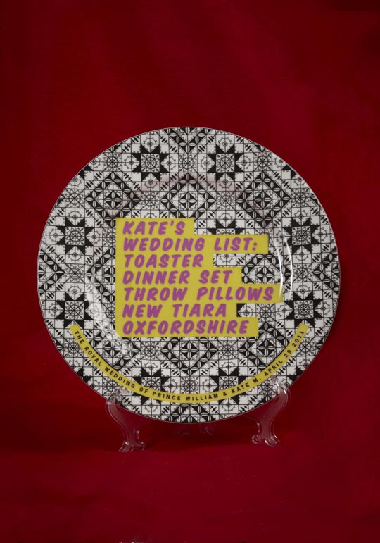
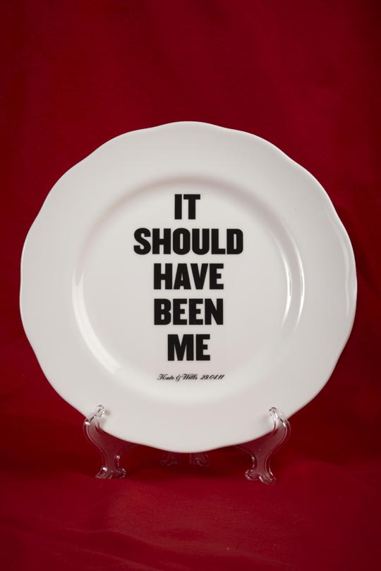
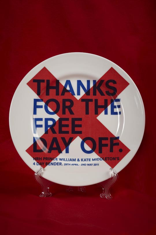
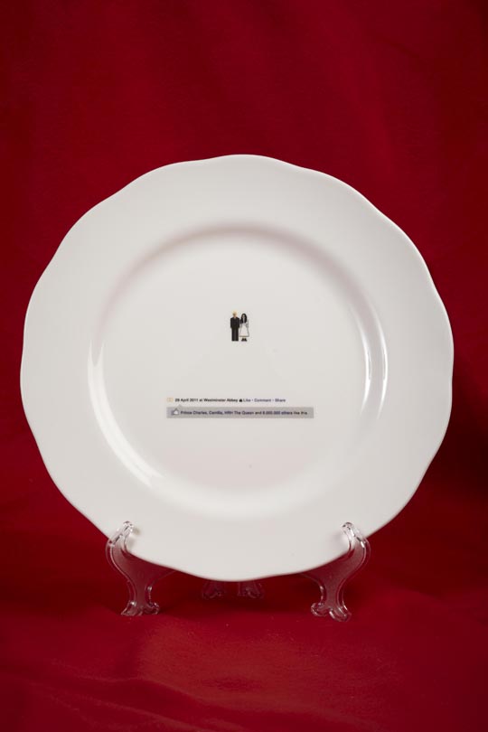
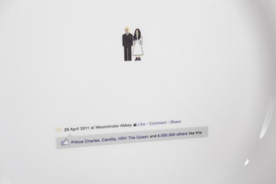
In early 2011 we had royal wedding fever in the UK. But before that really hit, around the end of 2010 and the news of the announcement of Prince William and Kate Middleton, there was little interest from a disillusioned, economically-ravaged public. We set about revamping the kitschy, ugly creations that usually form the basis of Royal souvenirs and tried to make them up-to-date, design-led and satirical. The thing became a bit of a monster…and what started as a nice self-initiated PR campaign became a massive plate making business, gained us a new client in the field of product design, and got us tons of press from all over the world. We never thought crockery could do that.
Comments are closed.